An Enterprise-Level App to Compare Grocery Prices

Gaj Varma
Communication manager at Frugl
"We've been fortunate to work with Andersen on our money-saving application"

UX-research
Having gathered the requirements for the product from the customer, we started a thorough investigation of the stores, the goods of which would be compared in the future app. Particularly, we focused on the assortment of goods, their prices, deals, and discounts. In addition, we studied consumer reviews on both stores to figure out the direction we should follow.
UI-system
When creating a user interface, we followed the principles of minimalism, simplicity, and attractiveness. Practically, it all was about the following direction: minimalism in colors, buttons, and icons, simple and intuitive navigation, and the use of delicious-looking food images.
Colors

Iconography

Buttons

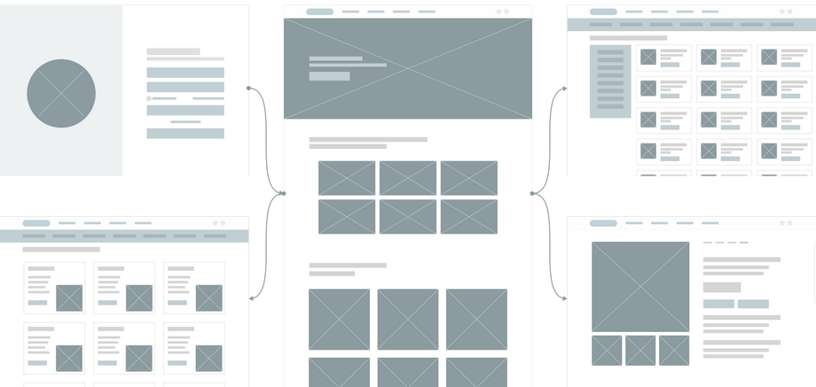
Wireframes
We never start working on a software solution without proper planning. No matter how simple the project is, we approach it responsibly to ensure our customer owns the best software product of its kind.
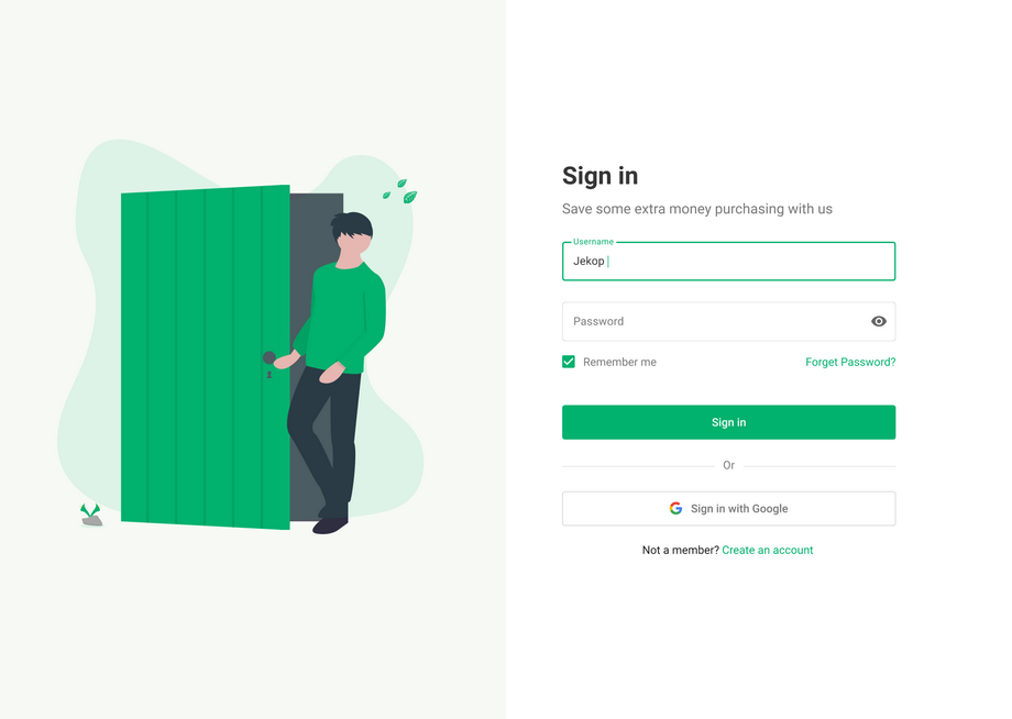
Sign in page
The application of such a type requires the most simple and quick entry. That’s why we chose a standard form and added the possibility to sign-in with Google.
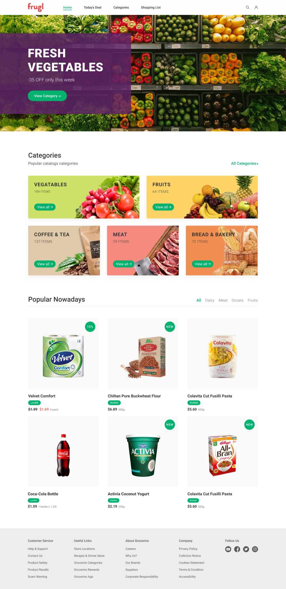
Home page
Along with the home page, there are three more tabs: today’s deals, where the user can view deals in both stores, categories of products, and virtual shopping list. The home page also displays the popular goods. Besides, we introduced a search box for the quick search of necessary products, which can be seen on the top-right corner.
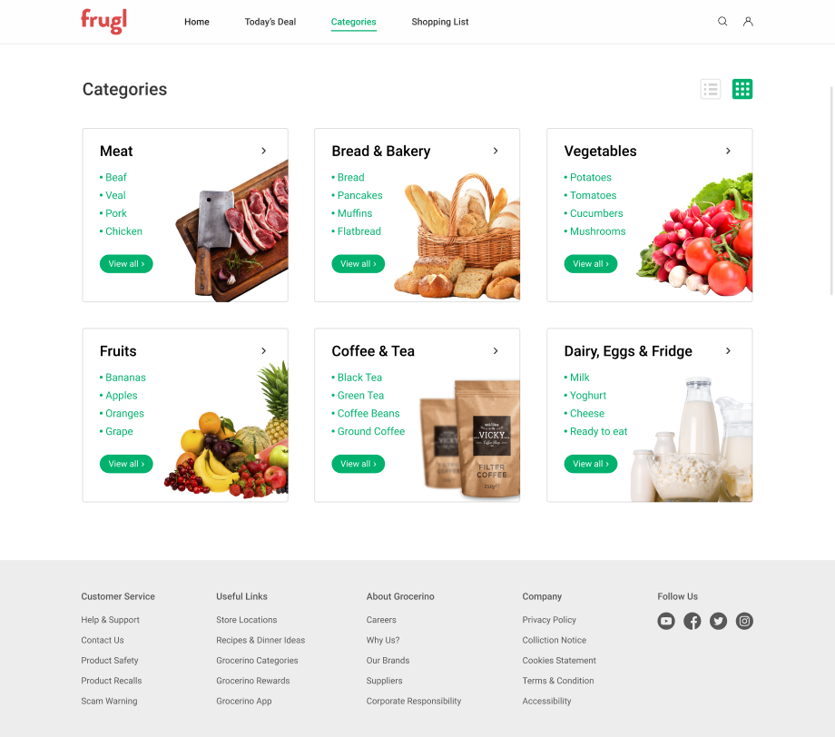
Categories page
Our UX/UI specialists saw about convenient sorting of goods on the platform: on the Categories page, various categories of goods are shown, divided into subcategories - all this to make the search easier. The categories can be viewed as a list or as cards with mouth-watering pictures.
Category page
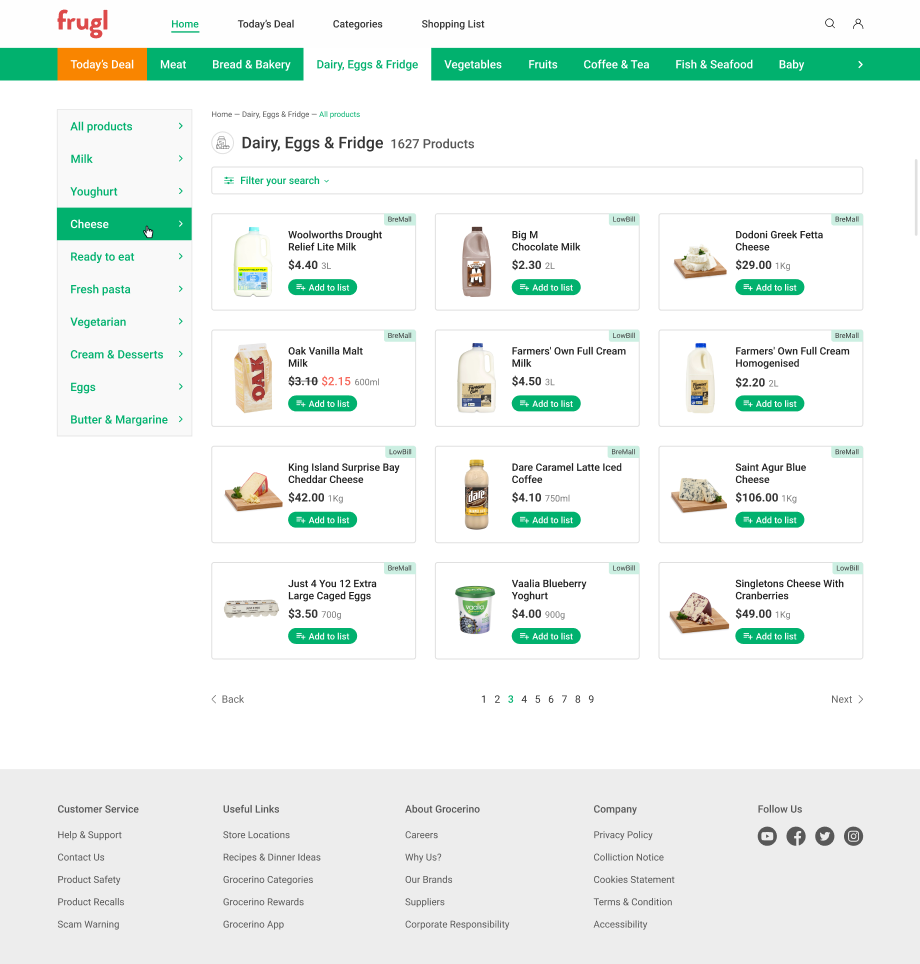
After choosing a category and subcategory, the user can see all the items on offer, with names, images, prices. On the top-right corner of each item card, the name of the store that sells the item is shown.
Filters
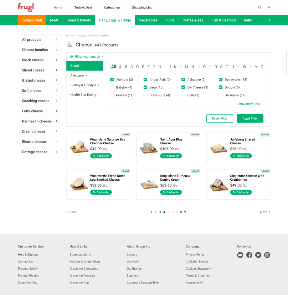
Since the app compares prices of hundreds of products sold in the largest stores, sorting the goods just by categories and subcategories is not enough. That’s why we implemented several filters. Unlike categories, the filters display the goods not by the type but by other important parameters: producers, allergen-free items, dietary, health star rating.
Product detailed page
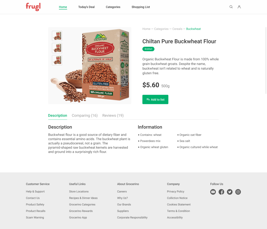
Clicking on an item card, we go to the page that shows more detailed information about a selected product: brand, description, weight, price, and even reviews. The user can choose the quantity and add the product to the shopping list that can be viewed later in a store.
Compare
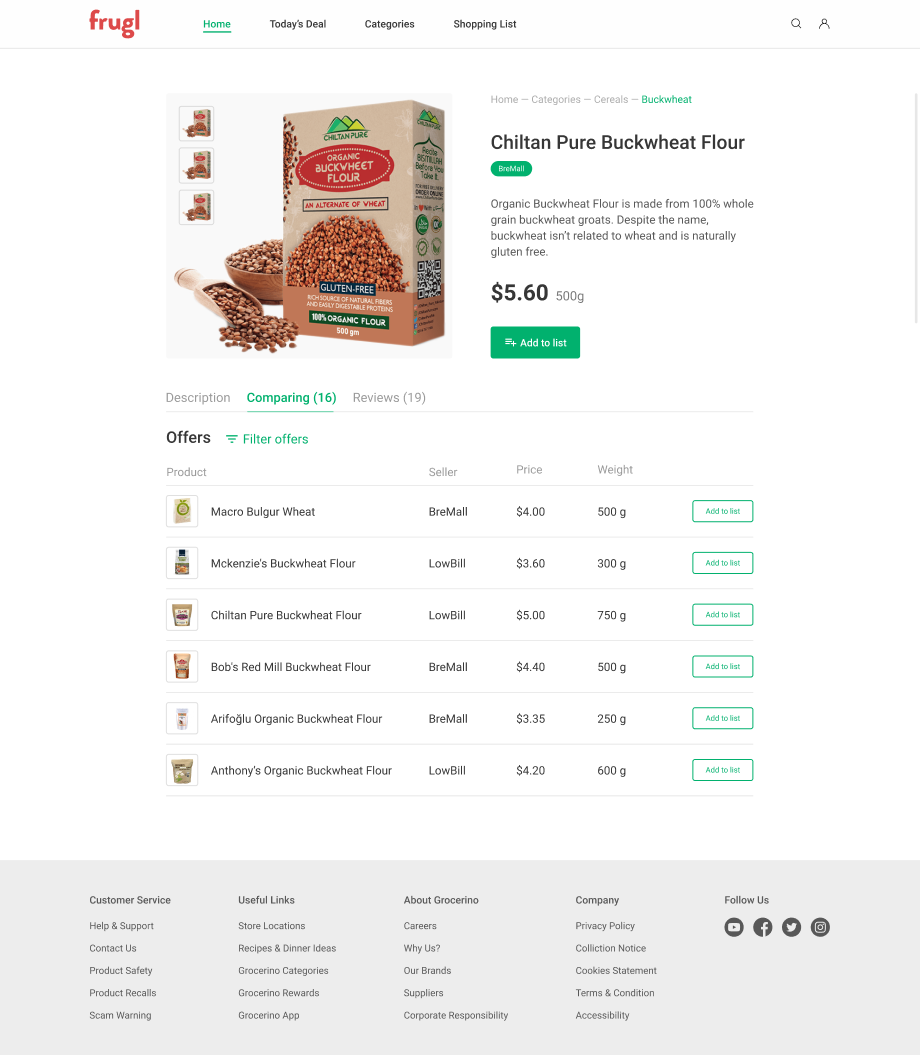
The main function of the application is the possibility to compare prices of the products offered by two largest stores, and here is how it works: on the product page, the user clicks on the Compare button, and the platform shows all the variants of the selected product with price, weight, and the store so that the consumer can choose the more advantageous variant and thus draft the most budget-friendly shopping list.
Customer review
We’ve been fortunate to work with Andersen on our money-saving application. We saw their professionalism, communicative and technical skills, which make the entire team personable and enjoyable to work with. Thank you for your diligent work and the responsibility you showed during the project development.

Gaj Varma
Communication manager at Frugl
Let's talk about your IT needs
What happens next?
An expert contacts you after having analyzed your requirements;
If needed, we sign an NDA to ensure the highest privacy level;
We submit a comprehensive project proposal with estimates, timelines, CVs, etc.
Customers who trust us


