Asset Management App
"Andersen augmented the staff of an accounting SaaS company. The team provided development services to help build out the company's platform."
About the client
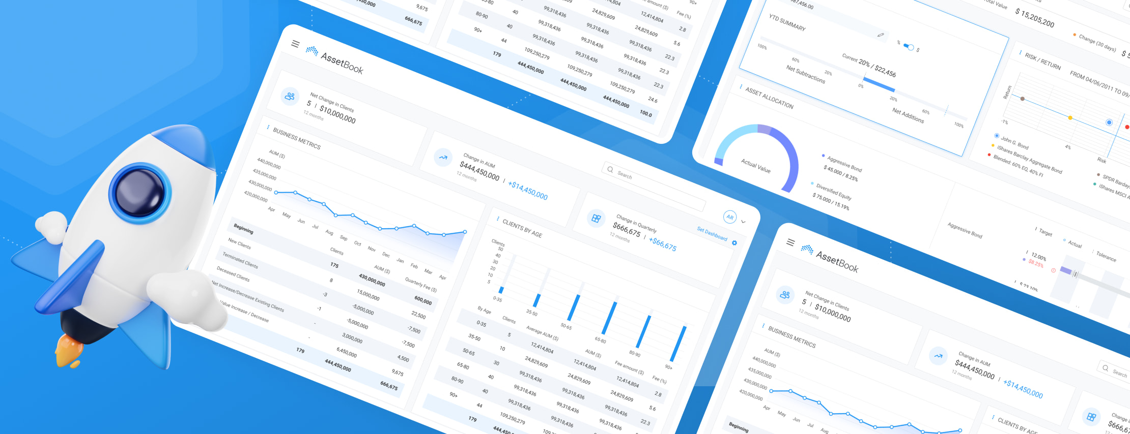
The business goal that AssetBook pursues is to assist advisors with tackling their daily professional challenges via evaluation and diagnosis of their portfolio management and reporting practices, as well as with the crucial applicable business metrics.
![[object Object] on the map](https://static.andersenlab.com/andersenlab/new-andersensite/bg-for-blocks/about-the-client/usa-desktop-2x.png)
About the project
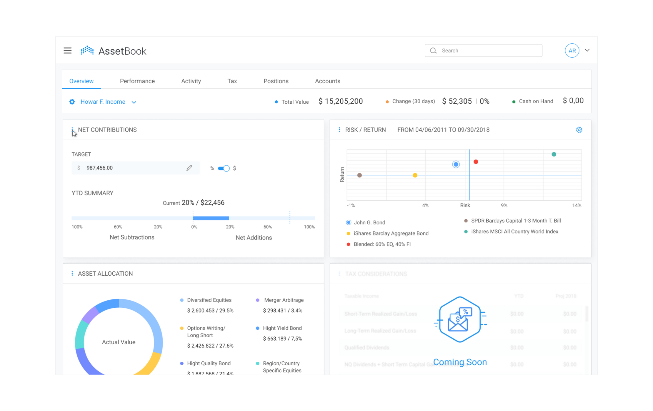
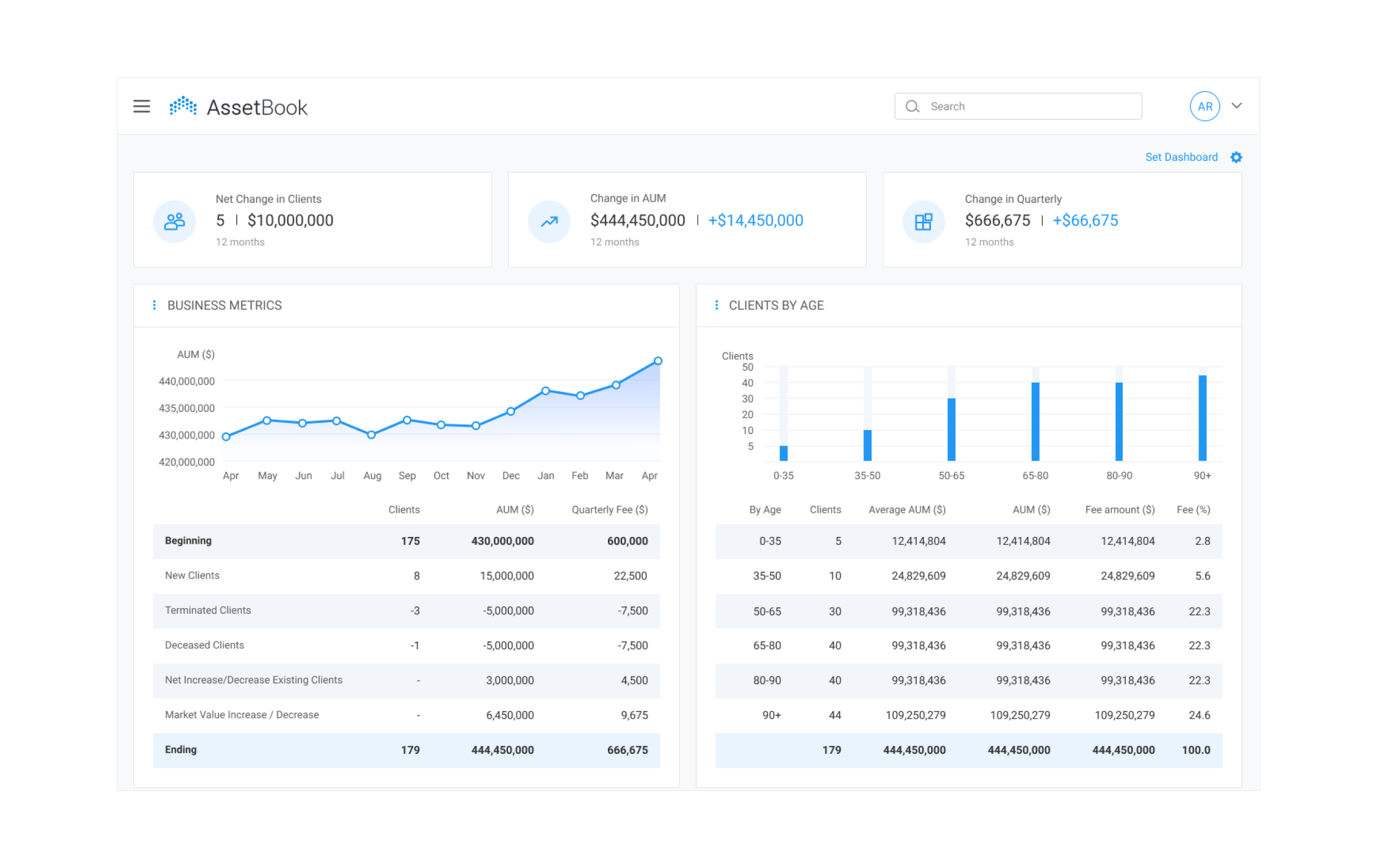
Andersen helped the customer develop a modern, dependable, and high-performing asset management app. With the app at their disposal, end-users are able to spend much less time and effort evaluating the performance of their client's portfolios. For maximum convenience and efficiency, we took care of the asset management UI design as well. It enables users to run portfolios based on, among other things, the tracking of the asset condition and price, dynamics, pre-defined periods for measurements, profits and losses, etc. Finally, we provided high-level help with QA for such a demanding project.
Challenges
While working on this IT asset management solution, our team faced and successfully resolved a range of challenges, including:
- Absence of detailed documentation, which was impeding effective onboarding;
- Tough deadlines for the planned release;
- The requirement for the solution to function across four different browsers and two operating systems.
Solution
The customer obtained a web and mobile platform relying on client-server architecture and a service approach. This platform makes it possible to monitor, report, and manage IT portfolios. End-users can allocate assets, track wealth, and ensure dependable custodial and tech integrations. The range of functionalities and features we delivered encompasses:
- Engaging, simple, and intuitive portfolio management system engineered with an open API;
- Screens created to address most questions concerning portfolios – e.g. an overview of portfolio performance, tax considerations, or asset administration;
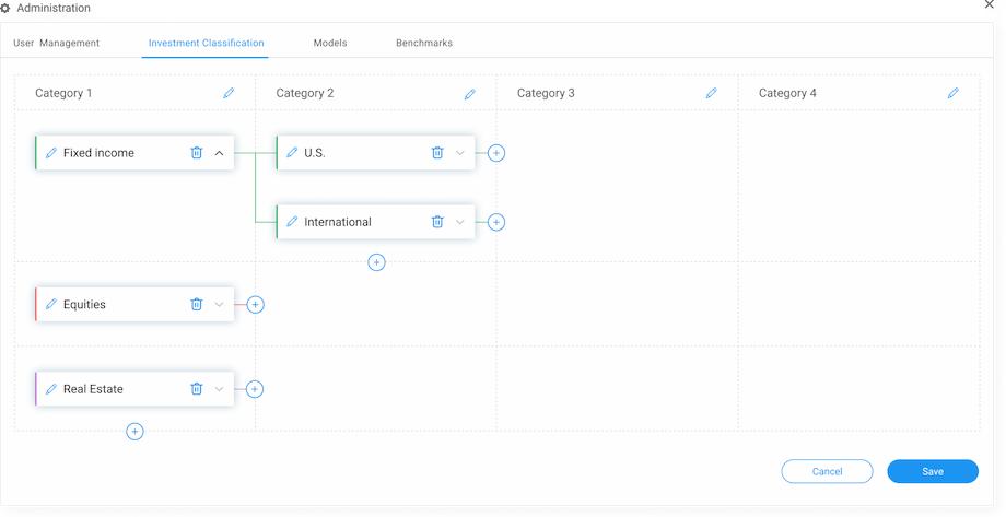
- Powerful allocation monitoring capability featuring several layers for classification and reporting;
- An automated fee billing system;
- Portfolio cash management feature;
- Advanced capabilities for tax planning and management;
- Tools for collaboration and client engagement.
Project results
- Major defects in production have been prevented;
- Product satisfaction in the app store has improved, and the average score has risen;
- Test coverage has risen to 95%;
- The testing process has become crystal-clear and transparent for the stakeholders.
Customer review
While the engagement is ongoing, the development work so far has met the expectations of the internal team. Andersen provides quality services in a timely manner, leading to an extended partnership. The team is talented, professional, and personable.

Chief Technology Officer AssetBook
UX research
Before the actual creation of the asset management system design, we did deep research on applicable UX aspects and elements and over 15 similar solutions that are available. Having analyzed the collected information, our designers envisioned a user interface. It offers effective firm-level dashboards, convenient client portals, etc.
UI system
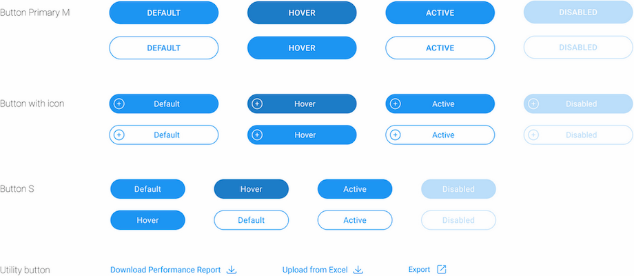
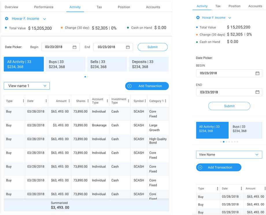
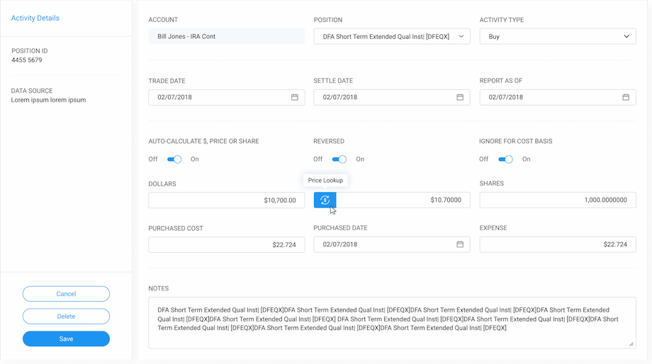
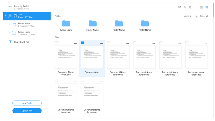
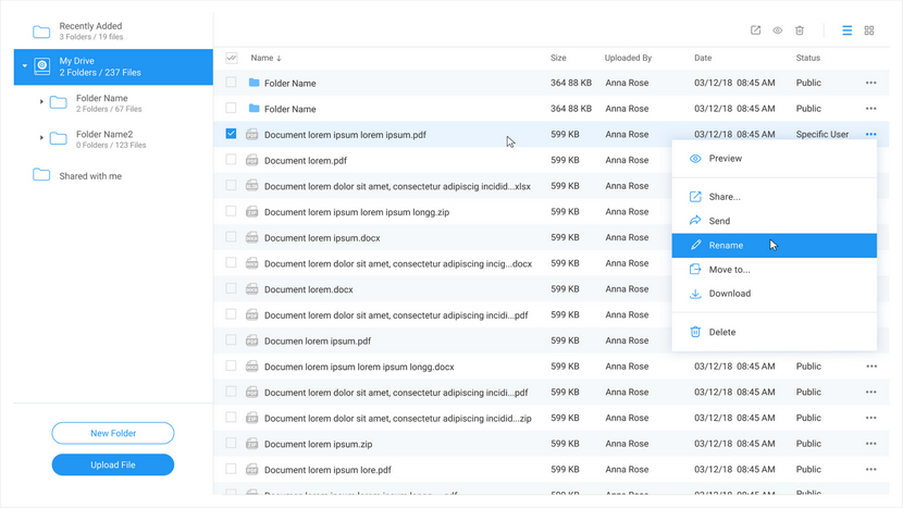
The app is designed in blue and white. The color scheme of the resulting design has no other shades or harsh colors so that user attention isn't distracted when viewing the content. The interface only features the most needed and relevant buttons to avoid overburdening. Also, our design experts were guided by the principle of minimalism while working on the icons.
Buttons
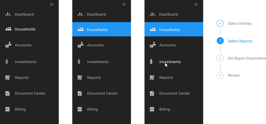
Navigations
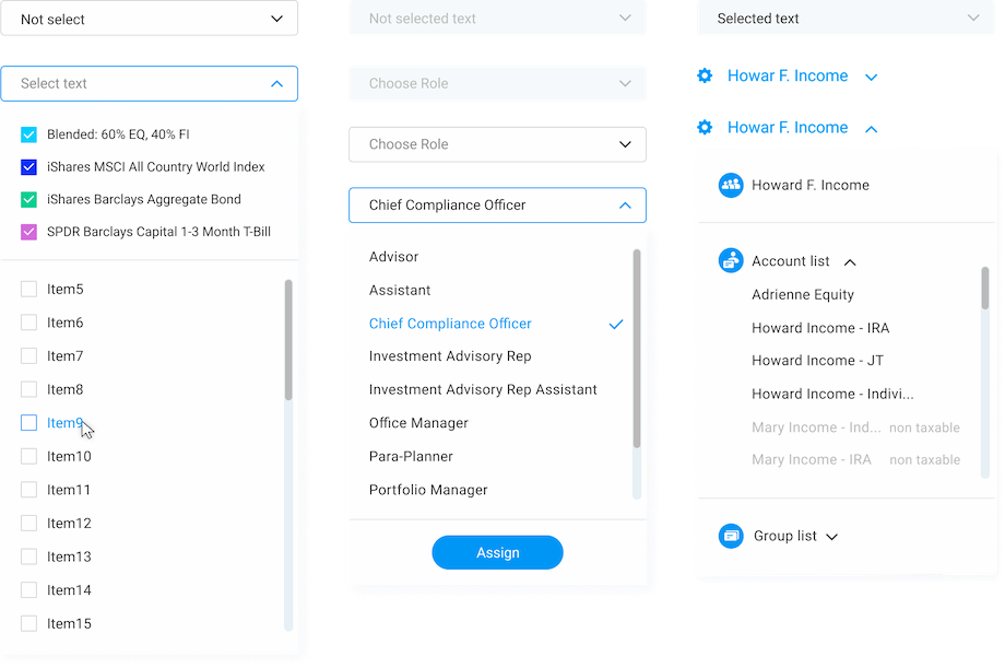
Menu
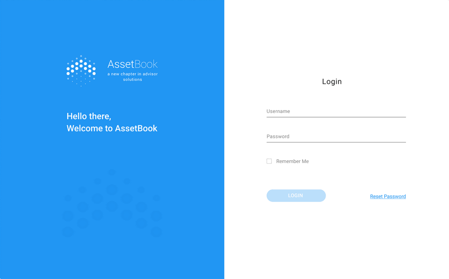
Login Page
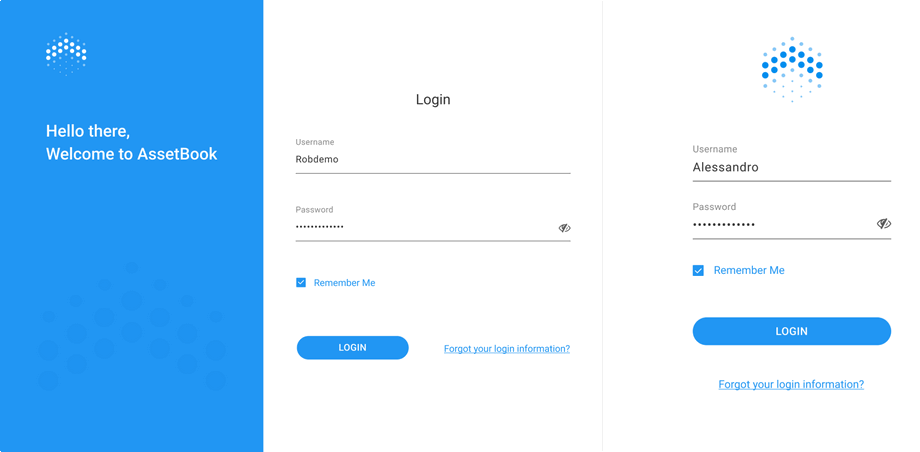
Impersonation

Dashboard

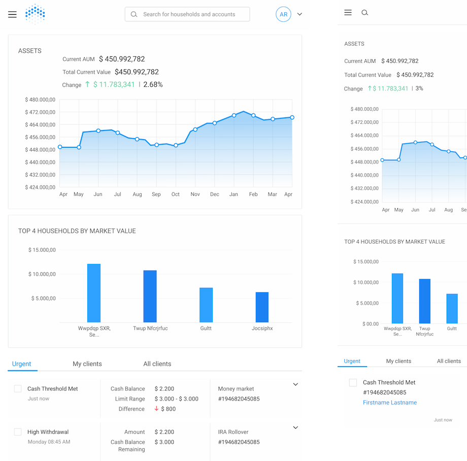
Notification Center
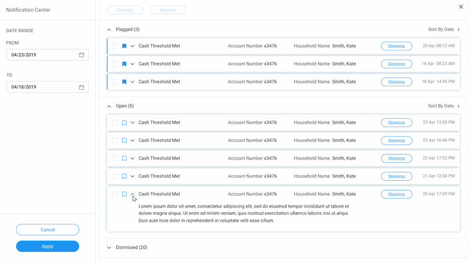
Dashboard
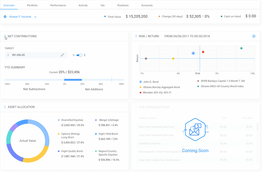
Activity
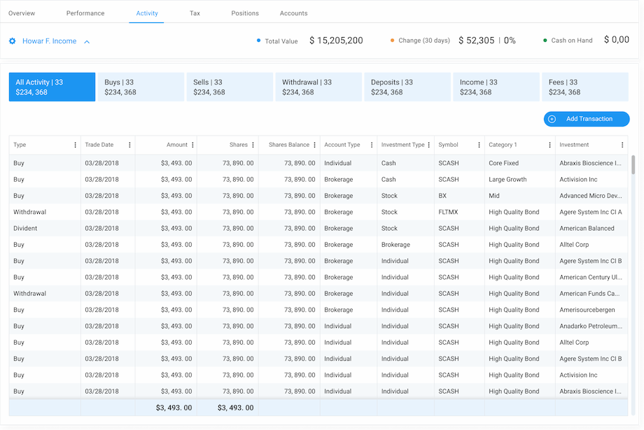
Activity Details
Document Center
Setting. Administration
Let's talk about your IT needs
What happens next?
An expert contacts you after having analyzed your requirements;
If needed, we sign an NDA to ensure the highest privacy level;
We submit a comprehensive project proposal with estimates, timelines, CVs, etc.
Customers who trust us


